We have now built up all of the knowledge necessary to do some data analysis. We’re going to start with something that you’re probably very familiar with: finding a straight line of best fit.
In all of the following examples, we will be dealing with abstract data (i.e. \(x\) and \(y\) rather than volume and pressure, or time and concentration etc.), so as to focus on the methodology behind what we are doing rather than the details of the data itself. We’ll apply these techniques to chemical problems in the Synoptic Exercises.
A simple example - Ordinary Least Squares
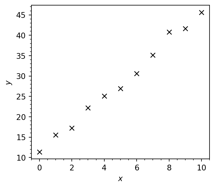
Let’s imagine that we’ve been given some experimental data that is evidently linear:
import matplotlib.pyplot as pltimport numpy as np%config InlineBackend.figure_format='retina'# Load linear.csv into two arraysx, y = np.loadtxt('linear.csv', delimiter=',', unpack=True)fig, ax = plt.subplots(figsize=(4, 3.5))# Plot data as markers with no lineax.plot(x, y, marker='x', lw=0, color='k')# Set axis labelsax.set_xlabel(r'$x$')ax.set_ylabel(r'$y$')# Enable minor ticksax.minorticks_on()fig.tight_layout()plt.show()
Notice that color='k' gives a black line, 'b' is blue!
We want to find the straight line that is as close as possible to all the experimental data points. We can write a familiar equation for this line:
\[y = mx + c,\]
where \(m\) is the slope and \(c\) is the intercept. The “optimum” values of \(m\) and \(c\) (i.e. those which give the line of best fit) can be found by performing a linear regression.
Of the many methods available for performing linear regression, perhaps the simplest is SciPy’s linregress function which uses ordinary least squares (OLS).
from scipy.stats import linregressregression_data = linregress(x, y)print(regression_data)
We have called the linregress function with two arguments: x and y which contain the experimental \(x\) and \(y\)-data as plotted previously.
regression_data = linregress(x, y)
The output of the linregress function is stored in a variable called regression_data, which we pass this to the print function:
print(regression_data)
The information returned from the linregress function contains the slope (\(m\)) and the \(y\)-intercept (\(c\)) of the line of best fit, alongside other useful information which we will further discuss shortly.
We can access the slope \(m\) and the intercept \(c\) as regression_data.slope and regression_data.intercept, respectively:
The coefficient of determination (\(R^2\)) measures the goodness-of-fit or, more accurately, quantifies how well a model describes a set of datapoints. This can also be obtained from regression_data.
print(f'R² = {regression_data.rvalue **2:.3g}')
R² = 0.992
Alternatively, \(R^2\) can instead be calculated as
where \(SS_\mathrm{res}\) is the sum of squared residuals - the sum of the squared differences between the predicted and actual values, while \(SS_\mathrm{tot}\) is the total variance in the data (how far the data lies from the mean).
where \(y_i\) is the \(i^\mathrm{th}\) observed value, \(\hat{y}_i\) is \(i^\mathrm{th}\) predicted value according to the model, and \(\bar{y}\) is the mean observed value.
NoteTest Yourself
Write a function to compute \(R^2\) using the above formulae - it should match regression_data.rvalue**2!
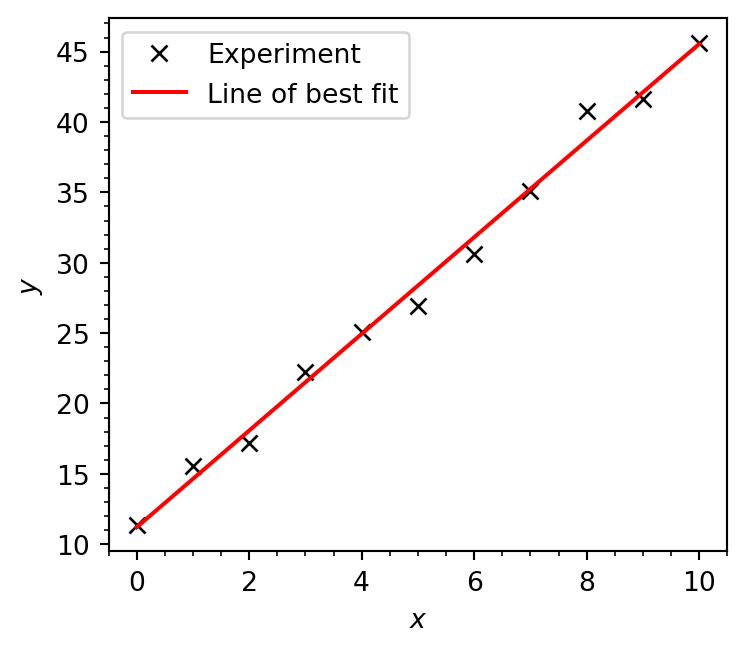
We now have all the information we need to construct and plot our line of best fit:
# Generate data for line of best fit# y = mx + cy_best_fit = regression_data.slope * x + regression_data.interceptfig, ax = plt.subplots(figsize=(4, 3.5))# Plot data as markers with no lineax.plot(x, y, marker='x', lw=0, label='Experiment', color='k')# Plot line of best fitax.plot(x, y_best_fit, label='Line of best fit', color='r')# Set axis labelsax.set_xlabel(r'$x$')ax.set_ylabel(r'$y$')# Enable minor ticksax.minorticks_on()# Add legend boxax.legend()fig.tight_layout()plt.show()
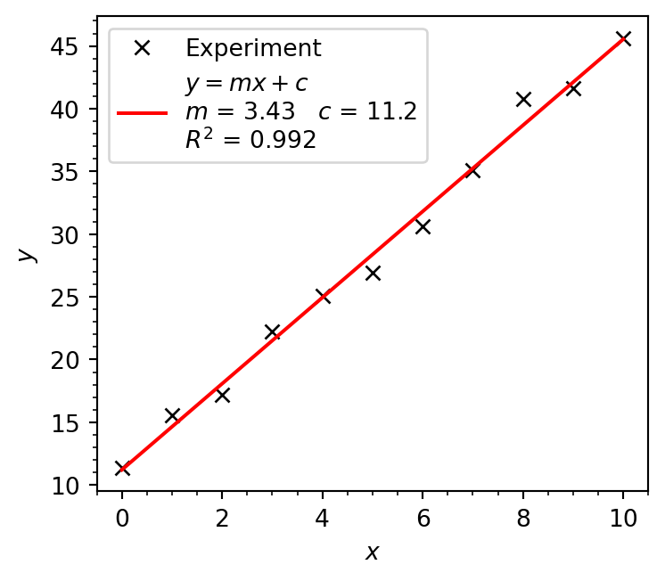
When plotting in Excel (and using LINEST) you’ve probably included the model parameter values (\(m\), and \(c\)) and \(R^2\) value in the plot itself. This can also be done in Matplotlib.
# Generate data for line of best fit# y = mx + cy_best_fit = regression_data.slope * x + regression_data.interceptfig, ax = plt.subplots(figsize=(4, 3.5))# Plot data as markers with no lineax.plot(x, y, marker='x', lw=0, label='Experiment', color='k')# Make label for line of best fitlobf_label =r'$y = mx+c$'lobf_label +='\n'+'$m$ = '+f'{regression_data.slope:.3g} 'lobf_label +=r'$c$ = '+f'{regression_data.intercept:.3g}'+'\n'lobf_label +='$R^2$ = '+f'{regression_data.rvalue**2:.3g}'# Plot line of best fitax.plot(x, y_best_fit, label=lobf_label, color='r')# Set axis labelsax.set_xlabel(r'$x$')ax.set_ylabel(r'$y$')# Enable minor ticksax.minorticks_on()# Add legend boxax.legend()fig.tight_layout()plt.show()
In reality, it’s much better to simply label this line as “Linear fit” and then include the model parameters, goodness-of-fit statistic, and any other information in the caption of your figure.
Including experimental uncertainties - Weighted Least Squares
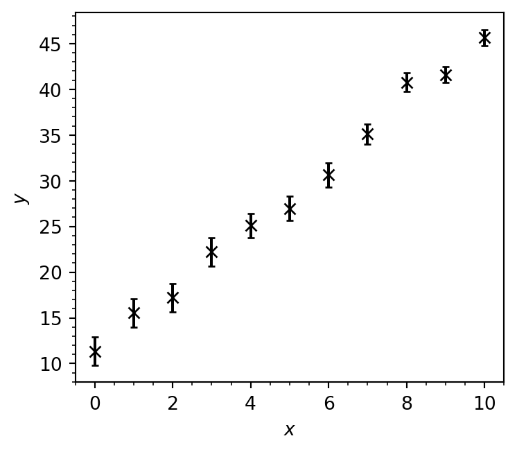
Let’s add some uncertainty to the experimental \(y\)-data from our previous example:
# variance in each data pointy_err = [1.55, 1.55, 1.53, 1.53, 1.33, 1.33, 1.33, 1.12, 1.02, 0.9, 0.9]# Create figure and axisfig, ax = plt.subplots(figsize=(4, 3.5))# Plot datapoints with error bars in y valueax.errorbar(x, y, y_err, fmt='kx', capsize=2.)# Set axis labelsax.set_xlabel(r'$x$')ax.set_ylabel(r'$y$')# Enable minor ticksax.minorticks_on()fig.tight_layout()plt.show()
As you can see above, we can plot error bars using ax.errorbar, passing the size of each error bar as a third argument (here passed as the variable y_err). The fmt keyword argument is used to tell Matplotlib that the data should be represented as black k crosses x with no line.
To perform a linear regression on this dataset and explicitly account for the experimental uncertainty, we are going to use the curve_fit function from scipy.optimise which carries out a weighted least-squares (WLS) linear regression.
from scipy.optimize import curve_fit
Given that we’re trying to fit a straight line, you might be wondering why we’re using a function with the word curve in it. Firstly, a curve does not actually need to be “curved”, and secondly curve_fit is a more robust function than linregress which actually allows us to also carry out non-linear regression. In our case we’re using it since it allows us to provide uncertainties in the \(y\) data via the sigma keyword, and uses the WLS method to obtain our line of best fit.
Since curve_fit is not limited to fitting straight lines (hence the curve in the name) we have to specify the model we would like to try to fit to our dataset. In this case, our data is linear, so the model we are going to try and fit is the equation of a straight line
\[y = mx + c\]
where \(m\) is the slope and \(c\) is the intercept. We can define this model in Python as a function:
def straight_line(x, m, c):"""Calculates y = mx + c (the equation of a straight line). Arguments --------- x: np.ndarray x values m: float gradient of line c: float y intercept of line Returns ------- np.ndarray y values of model """return m * x + c
We can now pass our function as an argument to curve_fit, also passing the experimental \(x\) and \(y\) data as well as the uncertainties using the sigma keyword argument:
popt, pcov = curve_fit(straight_line, x, y, sigma=y_err)
curve_fitreturns two NumPy arrays. The first is
print(popt)
[ 3.45325015 11.13753085]
which contains the optimised parameters for our model in the order they are specified in the function definition. In this case, our straight_line function takes the arguments x, m and c:
def straight_line(x, m, c):
m comes before c, so the same order will be reflected in the optimised parameters
opt_m = popt[0]opt_c = popt[1]
The second array returned by curve_fit is the covariance matrix. This tells the variance of our fitted parameters (their ‘uncertainty’), and their covariance (how strongly they depend on each other).
To obtain the variance of each parameter, we simply extract the diagonal elements of this matrix.
# First element of the diagonal, row 1 column 1m_variance = pcov[0, 0]# Second element of the diagonal, row 2 column 2c_variance = pcov[1, 1]print(f'm = {opt_m:.3g} ± {np.sqrt(m_variance):.3g}')print(f'c = {opt_c:.3g} ± {np.sqrt(c_variance):.3g}')
m = 3.45 ± 0.105
c = 11.1 ± 0.735
Unlike when we used the linregress function, these errors actually account for the uncertainties in the experimental data. We take the square root here to get the standard error rather than the variance associated with each parameter.
Again, since curve_fit is more general than linregress we need to manually calculate \(R^2\) using the formula we showed previously.
We can visualise our fitted model (our line of best fit) just like we did before:
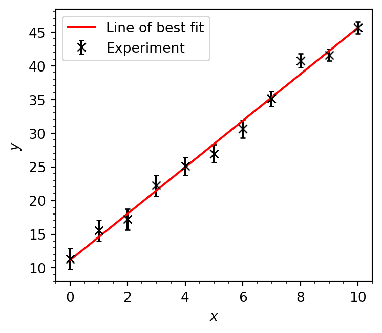
# Generate data for line of best fit# y = mx + cy_best_fit = opt_m * x + opt_cfig, ax = plt.subplots(figsize=(4, 3.5))# Plot data as markers with no lineax.errorbar(x, y, y_err, fmt='kx', capsize=2., label='Experiment')ax.plot(x, y_best_fit, label='Line of best fit', color='r')# Set axis labelsax.set_xlabel(r'$x$')ax.set_ylabel(r'$y$')# Enable minor ticksax.minorticks_on()# Add legend boxax.legend()fig.tight_layout()plt.show()
In this case, our final plot (and our values of \(m\) and \(c\)) are pretty similar whether we use the ordinary least-squares (linregress) or weighted least-squares (curve_fit with sigma) methods, but this is certainly not guaranteed to always be the case and it is therefore very important to propagate experimental uncertanties through to our fitted model parameters when possible.