import matplotlib.pyplot as plt
import numpy as np
%config InlineBackend.figure_format='retina'Matplotlib
Matplotlib is a powerful and incredibly popular plotting library which provides a wide range of plotting functions and allows for extensive customization.
Note
We include the line %config InlineBackend.figure_format='retina' to ensure that our plots look crisp and clear, especially on high-resolution displays. This is particularly important when we include these plots in scientific reports, as it ensures that they are clear and informative.
You will only need to include this line once in your notebook - it will apply to all subsequent plots.
Let’s make a simple plot of \(y = x^2\).
# 1000 linearly spaced values between -10 and 10
x = np.linspace(-10, 10, 1000)
f_x = x ** 2

# Create the figure and the axes
fig, ax = plt.subplots(nrows=1, ncols=1, figsize=(4, 3.5))

# Plot the data
ax.plot(x, f_x)

# Set the axis labels
ax.set_xlabel('x')
ax.set_ylabel('x**2')

# Show the plot
fig.tight_layout()
plt.show()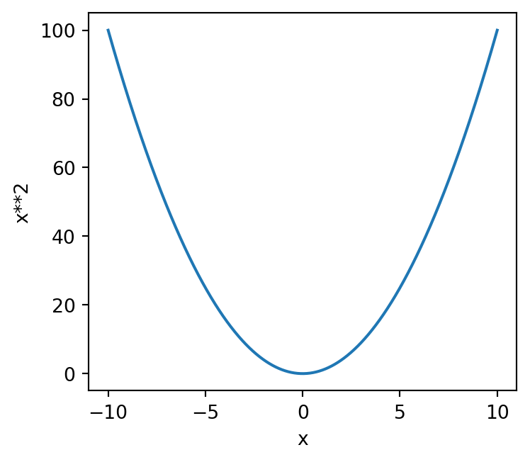
The first two lines will be familiar to you from Session 5. We create an array of 100 evenly spaced values between -10 and 10 using np.linspace(), and then we calculate the corresponding \(x^2\) values by squaring each element in the x array.
The next few lines are where we create our plot.
We first create figure (fig) and axes (ax) objects using plt.subplots() - these are where we will do our plotting. The two objects can be thought of as follows:
- Axes - A set of axes (x and y) onto which data is plotted - these live inside of the figure.
- Figure - the box into which axes objects are added - you can have more than one set of axes in a figure, we’ll see how this works in a little bit.
In the above example, we’ve used figsize=(4, 3.5) to specify a figure which is 4 inches wide and 3.5 inches tall. By specifying the nrows and ncols keywords both as 1, we’ve told Matplotlib to only make a single set of axes, i.e. “one graph”.
To actually add data to the plot, we use ax.plot(x, f_x). This plots x on the \(x\) axis, and f_x on the \(y\) axis. We’ll see later on that ax.plot has a lot of optional arguments which control the style of the line (or points) that we plot.
The next two lines specify the labels for the \(x\) and \(y\) axes as a pair of strings using ax.set_xlabel and ax.set_ylabel, respectively. We’ll see later on that we can, and should, improve the style of these so that they look more mathematically correct.
The final two lines are how we actually show the plot on our screen. We first call fig.tight_layout(), a special function that ensures our axes fit nicely in our figure. In particular, this fixes any overlapping axis labels, tick labels, or clipping of the axes outside of the figure. You should always include fig.tight_layout() unless you have a reason not to. Last but not least, the line plt.show() does exactly that - it shows our plot on the screen!
Lines and points
What would happen if we turned down the number of points in our linspace?
x = np.linspace(-10, 10, 5)
f_x = x ** 2

# Create the figure and the axes
fig, ax = plt.subplots(nrows=1, ncols=1, figsize=(4, 3.5))

# Plot the data
ax.plot(x, f_x)

# Set the axis labels
ax.set_xlabel('x')
ax.set_ylabel('x**2')

# Show the plot
fig.tight_layout()
plt.show()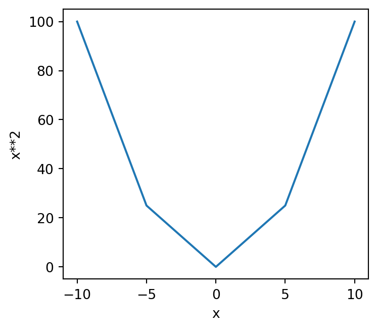
Our plot has become quite jaggedy or coarse. Clearly a line connecting these points is not very appropriate! For example, the value of \(x**2\) when \(x=2.5\) is not \(10\), but our plot makes it look like it is!
To overcome this, we can switch from plotting a line to plotting the individual points. To do this, we edit our call to ax.plot to turn off the line by setting it’s width (thickness) to zero (lw=0), and turn on cross shaped markers with marker='x'.
Note
Many different markers are available in Matplotlib - a full list is here.
x = np.linspace(-10, 10, 5)
f_x = x ** 2

# Create the figure and the axes
fig, ax = plt.subplots(nrows=1, ncols=1, figsize=(4, 3.5))

# Plot the data
ax.plot(x, f_x, lw=0, marker='x')

# Set the axis labels
ax.set_xlabel('x')
ax.set_ylabel('x**2')

# Show the plot
fig.tight_layout()
plt.show()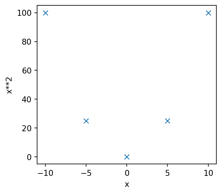
This is much better! It’s not appropriate to join up our points with lines when there are so few of them - the lines are completely meaningless!
Important
Discrete datasets (i.e. those with data at specific points) are usually better represented as points rather than joined up lines.
Continuous datasets (e.g. mathematical functions) are usually better represented by lines.
So why didn’t we use points earlier? Why did we use a line when our linspace contained 1000 points?
Well, let’s plot that data using points instead
# 1000 linearly spaced values between -10 and 10
x = np.linspace(-10, 10, 1000)
f_x = x ** 2

# Create the figure and the axes
fig, ax = plt.subplots(nrows=1, ncols=1, figsize=(4, 3.5))

# Plot the data
ax.plot(x, f_x, lw=0, marker='x')

# Set the axis labels
ax.set_xlabel('x')
ax.set_ylabel('x**2')

# Show the plot
fig.tight_layout()
plt.show()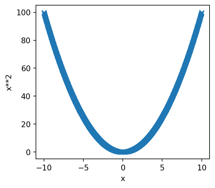
There are so many points (1000 in fact), that the data looks like a line - our discrete data is effectively continuous. This looks a bit rubbish, so we can keep it as a line with the knowledge that we aren’t miscommunicating anything about the data.
Axis labels
As we noted earlier, we can improve our axis labels by including mathematical notation. Our \(y\) axis has used x**2 but really this should employ a superscript \(x^2\).
To do this, we need to use Mathtext. For example
# 1000 linearly spaced values between -10 and 10
x = np.linspace(-10, 10, 5)
f_x = x ** 2

# Create the figure and the axes
fig, ax = plt.subplots(nrows=1, ncols=1, figsize=(4, 3.5))

# Plot the data
ax.plot(x, f_x, lw=0, marker='x')

# Set the axis labels
ax.set_xlabel(r'$x$')
ax.set_ylabel(r'$x^2$')

# Show the plot
fig.tight_layout()
plt.show()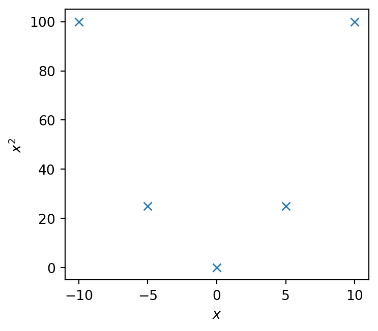
When writing Mathtext expressions, you must precede your string quotation marks with r - this tells Python to interpret this as a raw string, and to not mess with the strings formatting before Matplotlib gets a chance to read it.
We then specify that we’re using mathematical symbols and operators by using a pair of dollar symbols $, and between these write our mathematical operations.
This \(\LaTeX\) style syntax is exactly the same as what you use when writing equations in Markdown cells - we’ll see more of this in Session 7, and a helpful cheat sheet can be found here.
Multiple axes
We can modify the above example to include a second set of axes, and use it to plot \(f(x) = x^3\)
# 1000 linearly spaced values between -10 and 10
x = np.linspace(-10, 10, 1000)

# Create the figure and the axes
fig, (ax0, ax1) = plt.subplots(nrows=1, ncols=2, figsize=(8, 3.5))

# Plot the data of the first axis
ax0.plot(x, x ** 2)
# Set the axis labels of the first plot
ax0.set_xlabel(r'$x$')
ax0.set_ylabel(r'$x^2$')

# Plot the data of the second axis
ax1.plot(x, x ** 3)
# Set the axis labels of the second axis
ax1.set_xlabel(r'$x$')
ax1.set_ylabel(r'$x^3$')

# Show the plot
fig.tight_layout()
plt.show()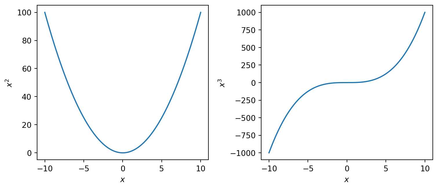
We’ve specified a figure with one row and two columns, giving us two axes to plot on. These are returned in a tuple, and we use multiple assignment and unpacking to create individual the objects ax0 and ax1 for the first and second axes, respectively.
We can then separately plot data onto each axis, just as we did before for a single axis.
Multiple datasets
We can also plot more than one dataset on a single axis. Let’s repeat the above, but combine the two plots.
# 1000 linearly spaced values between -10 and 10
x = np.linspace(-10, 10, 1000)

# Create the figure and the axes
fig, ax = plt.subplots(figsize=(4, 3.5))

# Plot the data
ax.plot(x, x ** 2)
ax.plot(x, x ** 3)

# Set the axis labels
ax.set_xlabel(r'$x$')
ax.set_ylabel(r'$f(x)$')

# Show the plot
fig.tight_layout()
plt.show()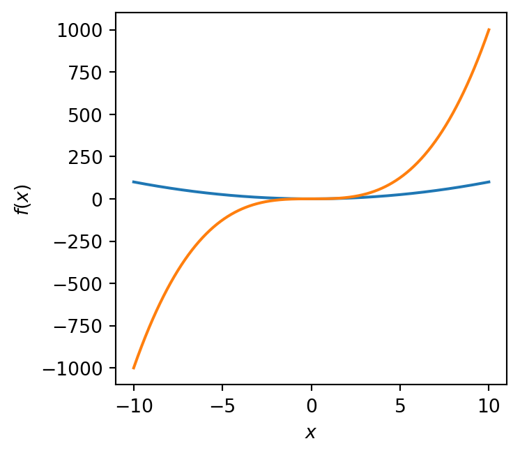
Great, but how do we know which plot is which? We can’t rely on the \(y\) axis label anymore since this is just \(f(x)\) - “function of \(x\)”.
To solve this, we include labels with each call to ax.plot using the label keyword, and then tell Matplotlib to include a legend (or “key” - no-one calls it this, sorry!)
# 1000 linearly spaced values between -10 and 10
x = np.linspace(-10, 10, 1000)

# Create the figure and the axes
fig, ax = plt.subplots(figsize=(4, 3.5))

# Plot the data, and provide a label for each plot
ax.plot(x, x ** 2, label=r'$f(x) = x^2$')
ax.plot(x, x ** 3, label=r'$f(x) = x^3$')

# Set the axis labels
ax.set_xlabel(r'$x$')
ax.set_ylabel(r'$f(x)$')

# Turn on the legend
ax.legend()

# Show the plot
fig.tight_layout()
plt.show()
This is much better!
Notice that we can use \(\LaTeX\) styling in the label argument, just as we did with the axis labels.
Twinned axes
Finally, we can include a second \(x\) or \(y\) axis in a process known as twinning an axis. Perhaps we might want to plot both the absorbance and transmittance in the infrared spectrum of water. You’ll need to download this file.
# Load the infrared data from file
wavenumber, transmittance, absorbance = np.loadtxt('water_ir_spectrum.dat', unpack=True, skiprows=1)

# Create the figure and the axes
fig, ax = plt.subplots(figsize=(4, 3.5))

ax.plot(wavenumber, transmittance, color='k', label='Transmittance')

ax.set_xlabel(r'Wavenumber / cm$^\mathregular{-1}$')
ax.set_ylabel('Transmittance')

# Set axis limits and enable minor ticks
ax.set_ylim(-0.05, 1)
ax.set_xlim(250, 3800)
ax.minorticks_on()

# Create twinned axis for absorbance
# Twinx means they will share the x axis but have different y scales
aax = ax.twinx()

# Plot absorbance data onto new twinned axis
aax.plot(wavenumber, absorbance, color='C0', label='Absorbance')
# Set y label for twinned axis with same color as the line
aax.set_ylabel('Absorbance', fontdict={'color': 'C0'})
# Add minor ticks
aax.minorticks_on()

fig.tight_layout()
plt.show()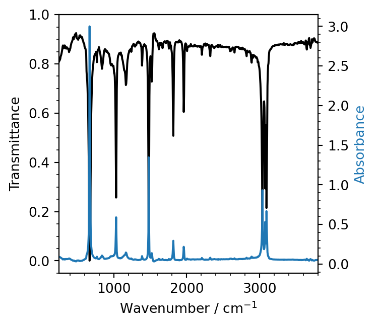
We create a second, twinned axis aax, which has the same \(x\) scale, but its own separate \(y\) scale. The absorbance data is then plotted onto this new axis.
Customisation
Colours
In the above, Matplotlib has decided on different colours for \(y=x^2\) and \(y=x^3\). By default, Matplotlib uses a set of colourblind friendly colours that it cycles through within a given axis. The color keyword argument can be used in the call to ax.plot to give a custom colour. This takes either a name or hexadecimal string value.
# 1000 linearly spaced values between -10 and 10
x = np.linspace(-10, 10, 1000)

# Create the figure and the axes
fig, ax = plt.subplots(figsize=(4, 3.5))

# Plot the data, and provide a label for each plot with custom colours
ax.plot(x, x ** 2, label=r'$f(x) = x^2$', color='black')
ax.plot(x, x ** 3, label=r'$f(x) = x^3$', color='#0cc631')

# Set the axis labels
ax.set_xlabel(r'$x$')
ax.set_ylabel(r'$f(x)$')

# Turn on the legend
ax.legend()

# Show the plot
fig.tight_layout()
plt.show()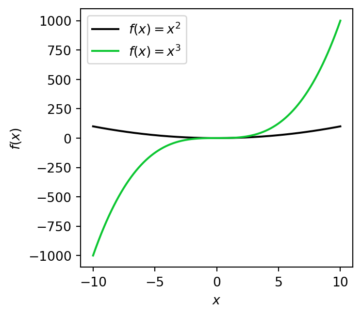
Linestyles and linewidths
The linestyle can be modified using the ls keyword, and the linewidth with the lw keyword
# 1000 linearly spaced values between -10 and 10
x = np.linspace(-10, 10, 1000)

# Create the figure and the axes
fig, ax = plt.subplots(figsize=(4, 3.5))

# Plot the data, and provide a label for each plot with custom colours
ax.plot(x, x ** 2, label=r'$f(x) = x^2$', color='black', ls='--', lw=2.)
ax.plot(x, x ** 3, label=r'$f(x) = x^3$', color='#0cc631', ls=':')

# Set the axis labels
ax.set_xlabel(r'$x$')
ax.set_ylabel(r'$f(x)$')

# Turn on the legend
ax.legend()

# Show the plot
fig.tight_layout()
plt.show()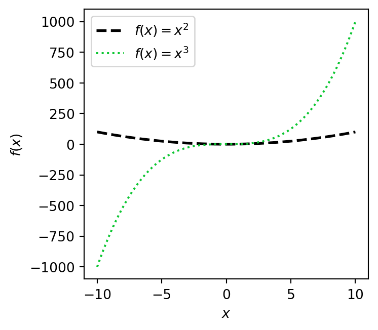
Axis ticks
We’ve already seen how to add axis labels with ax.set_xlabel and ax.set_ylabel, but how can we change the number of tick marks (or just ticks) on an axis? Well, there are in fact a great many ways of doing this and we’ll focus on a couple of the more simple ones.
First, let’s include minor ticks. These are unnumbered tick marks which are smaller than the numbered major ticks and make your plot a litle bit easier to read and estimate values from.
To enable minor ticks for both the \(x\) and \(y\) axes, we can use ax.minor_ticks_on. Matplotlib will choose their locations for us, and these are usually pretty good.
# 1000 linearly spaced values between -10 and 10
x = np.linspace(-10, 10, 1000)

# Create the figure and the axes
fig, ax = plt.subplots(figsize=(4, 3.5))

# Plot the data, and provide a label for each plot with custom colours
ax.plot(x, x ** 2, label=r'$f(x) = x^2$')
ax.plot(x, x ** 3, label=r'$f(x) = x^3$')

# Set the axis labels
ax.set_xlabel(r'$x$')
ax.set_ylabel(r'$f(x)$')

# Enable minor ticks on x and y
ax.minorticks_on()

# Turn on the legend
ax.legend()

# Show the plot
fig.tight_layout()
plt.show()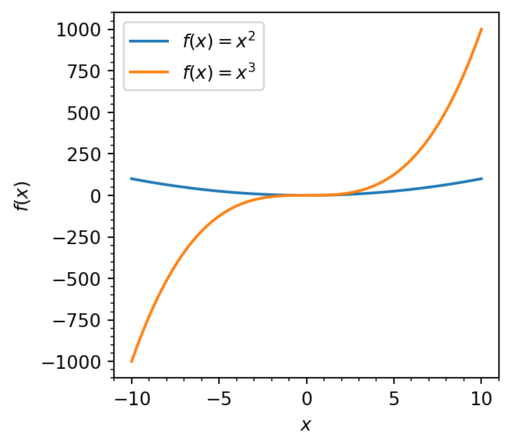
You can take this one step further and enable a grid in the background of your plot with ax.grid, specifying which='both', which='major', or which='minor' to control how many gridlines are drawn.
# 1000 linearly spaced values between -10 and 10
x = np.linspace(-10, 10, 1000)

# Create the figure and the axes
fig, ax = plt.subplots(figsize=(4, 3.5))

# Plot the data, and provide a label for each plot with custom colours
ax.plot(x, x ** 2, label=r'$f(x) = x^2$')
ax.plot(x, x ** 3, label=r'$f(x) = x^3$')

# Set the axis labels
ax.set_xlabel(r'$x$')
ax.set_ylabel(r'$f(x)$')

# Enable minor ticks on x and y
ax.minorticks_on()

# Enable gridlines for minor and major tick values
ax.grid(True, which='both')

# Turn on the legend
ax.legend()

# Show the plot
fig.tight_layout()
plt.show()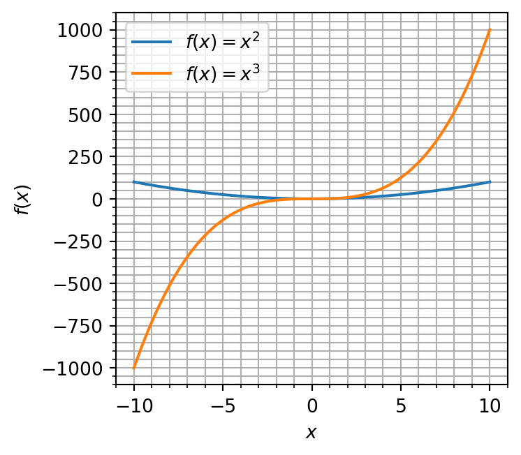
Which, you should realise, doesn’t look very good!
Important
While grids can be helpful, most of the time tend to make plots look very busy. It’s best to leave them off unless they have a reason to be included.
To actually specify where ticks should be placed, the ax.set_xticks and ax.set_yticks commands can be used.
# 1000 linearly spaced values between -10 and 10
x = np.linspace(-10, 10, 1000)

# Create the figure and the axes
fig, ax = plt.subplots(figsize=(4, 3.5))

# Plot the data, and provide a label for each plot with custom colours
ax.plot(x, x ** 2, label=r'$f(x) = x^2$')
ax.plot(x, x ** 3, label=r'$f(x) = x^3$')

# Set the axis labels
ax.set_xlabel(r'$x$')
ax.set_ylabel(r'$f(x)$')

# Specify x tick positions - these are very odd choices!
ax.set_xticks([-11, -5.2, 0, 2.3, 5.7, 10.1])

# Turn on the legend
ax.legend()

# Show the plot
fig.tight_layout()
plt.show()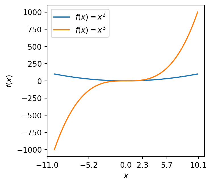
These are obviously quite strange choices, but they demonstrate that you can manually specify tick locations. A more rigorous way of setting tick positions is to use a locator.
from matplotlib.ticker import MultipleLocator

# 1000 linearly spaced values between -10 and 10
x = np.linspace(-10, 10, 1000)

# Create the figure and the axes
fig, ax = plt.subplots(figsize=(4, 3.5))

# Plot the data, and provide a label for each plot with custom colours
ax.plot(x, x ** 2, label=r'$f(x) = x^2$')
ax.plot(x, x ** 3, label=r'$f(x) = x^3$')

# Set the axis labels
ax.set_xlabel(r'$x$')
ax.set_ylabel(r'$f(x)$')

# Set major x ticks at multiples of 2
ax.xaxis.set_major_locator(MultipleLocator(2))

# Turn on the legend
ax.legend()

# Show the plot
fig.tight_layout()
plt.show()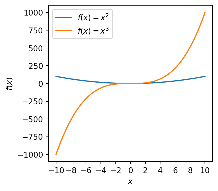
We have imported the MultipleLocator object from matplotlib.ticker. We then specify a value (here 2), and \(x\) ticks are placed at multiples of this value.
Similarly, we can use set_minor_locator to set the positions of minor ticks using a locator.
There are different types of locator available, but in this course MultipleLocator will certainly suffice if you even need to use it at all!
Axis limits
Axis limits can be specified using the ax.set_xlim and ax.set_ylim functions.
# 1000 linearly spaced values between -10 and 10
x = np.linspace(-10, 10, 1000)

# Create the figure and the axes
fig, ax = plt.subplots(figsize=(4, 3.5))

# Plot the data, and provide a label for each plot with custom colours
ax.plot(x, x ** 2, label=r'$f(x) = x^2$')
ax.plot(x, x ** 3, label=r'$f(x) = x^3$')

# Set custom x limits
ax.set_xlim(0, 10)

# Set custom y limits
ax.set_ylim(-10, 1100)

# Set the axis labels
ax.set_xlabel(r'$x$')
ax.set_ylabel(r'$f(x)$')

# Turn on the legend
ax.legend()

# Show the plot
fig.tight_layout()
plt.show()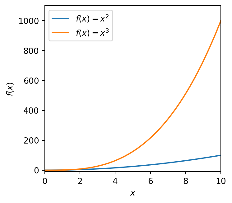
Spines
The top and right outlines of the axes can be removed using the ax.spines object.
# 1000 linearly spaced values between -10 and 10
x = np.linspace(-10, 10, 1000)

# Create the figure and the axes
fig, ax = plt.subplots(figsize=(4, 3.5))

# Plot the data, and provide a label for each plot with custom colours
ax.plot(x, x ** 2, label=r'$f(x) = x^2$')
ax.plot(x, x ** 3, label=r'$f(x) = x^3$')

# Remove right and upper spines
# these are the "outlines" of the axis
ax.spines['top'].set_visible(False)
ax.spines['right'].set_visible(False)

# Set the axis labels
ax.set_xlabel(r'$x$')
ax.set_ylabel(r'$f(x)$')

# Turn on the legend
ax.legend()

# Show the plot
fig.tight_layout()
plt.show()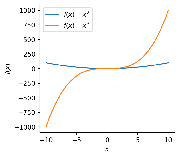
Important
By now it’s probably becoming clear that Matplotlib can be customised in a great many ways! The full documentation is exhaustive, and lists everything you might ever want to know.
The best way to learn is to try things out and understand them when they break - you aren’t expected to memorise Matplotlib’s near infinite options!
Saving plots
One last thing - how can we save a plot to file?
This is very simple, use plt.savefig.
# 1000 linearly spaced values between -10 and 10
x = np.linspace(-10, 10, 1000)

# Create the figure and the axes
fig, ax = plt.subplots(figsize=(4, 3.5))

# Plot the data, and provide a label for each plot with custom colours
ax.plot(x, x ** 2, label=r'$f(x) = x^2$')
ax.plot(x, x ** 3, label=r'$f(x) = x^3$')

# Remove right and upper spines
# these are the "outlines" of the axis
ax.spines['top'].set_visible(False)
ax.spines['right'].set_visible(False)

# Set the axis labels
ax.set_xlabel(r'$x$')
ax.set_ylabel(r'$f(x)$')

# Enable minor ticks
ax.minorticks_on()

# Turn on the legend
ax.legend()

# Tighten the layout
fig.tight_layout()

# Save the plot - this MUST come before plt.show
plt.savefig('squared_and_cubed.png', dpi=300)

# Show the plot
plt.show()
Here we’ve saved our image as a .png file with a resolution of 300 dots-per-inch (DPI or dpi). You should now see the plot in your file browser.
You MUST always use plt.show after plt.savefig. Otherwise your saved image will be blank!